What are CSS Container Queries?
How different are CSS container queries from media queries?


CSS has evolved in many aspects over the period. Think of managing the content with help of floats, then displaying the content in stacked style with the help of media queries where a lot of CSS has to be written for managing the entire page elements which turned out to be cumbersome when it is in abundance.
Managing the media queries based on the viewport size, the elements had to be placed on the screen. Although, many of the websites still manage the elements based on the viewport size (width/ height) for its layout.
Now, think of the situation where you don’t have to rely totally on the viewport size instead you can trust your parent element where you are placed. Think of the position style as a “relative” analogy.
That’s what the container queries do.
As per the MDN definition, CSS container query…
CSS containment provides a way to isolate parts of a page and declare to the browser these parts are independent of the rest of the page in terms of styles and layout.
Q. What is CSS containment?
CSS containment leverages to improve the page performance by isolating the sub-tree (sub-part) of the page from the rest of the page. Doing this, if the browser understands that a part of the page is independent, it can be better optimized.
It also indicates whether the elements should display all of the contents and also display the contents when it is off-screen.
Let’s focus on the container queries as of now.
If you are doing a responsive design, we often use media queries to change the page layout based on the viewport. We group the common HTML elements into reusable components that have a specific layout depending on the available space on a page.
When it comes to container queries, it allows us to look at a container size and apply styles to the contents based on the size of their container rather than the viewport.
Let’s try to deep dive in detail.
A basic container query is written as follows.

There are 3 types of container types.
size — The query will be based on the inline and block dimensions of the container. It applies to the layout, style, and size containment of the container.
inline size — The query will be based on the inline dimensions of the container. It applies to the layout, style, and inline-size containment of the element.
normal — The element is not a query container for any container size queries, but remains a query container for container-style queries.
Mostly, in most cases, we use the inline-size container type.
CSS container units.
cqw — 1% of a query container’s width.
cqh — 1% of a query container’s height.
cqi — 1% of a query container’s inline size.
cqb — 1% of a query container’s block size.
cqmin — The smaller value of either cqi/ cqb.
cqmax — The larger value of either cqi/ cqb.
In this article, we will focus on responsive design using container query and flexbox.
Initially, we will try to use the design using flexbox.

The final design will be as follows.

Let’s see what are trying to do here in the example shown above.
Let's try to see the HTML code for this design.

We have a card class whose container type is “inline-size” and a container name to which this CSS design will be applied.

Let’s see how are going to change the orientation of the main container based on the container size instead of the viewport.
The default CSS for the main container is as follows.

Now, let’s see how we change the orientation if we use the container queries.

Moving on, now let’s see the content which is placed inside the card container.
This is the default CSS for our card content style. This is going to change with the help of the container query as we progress in the article.
Before that, let’s see how the card container looks alike. If you are familiar with the flexbox, it will make sense.

By default, we are stacking the elements that is one below the other with a gap of 0.5rem;
This is what our card looks like with the above container CSS.
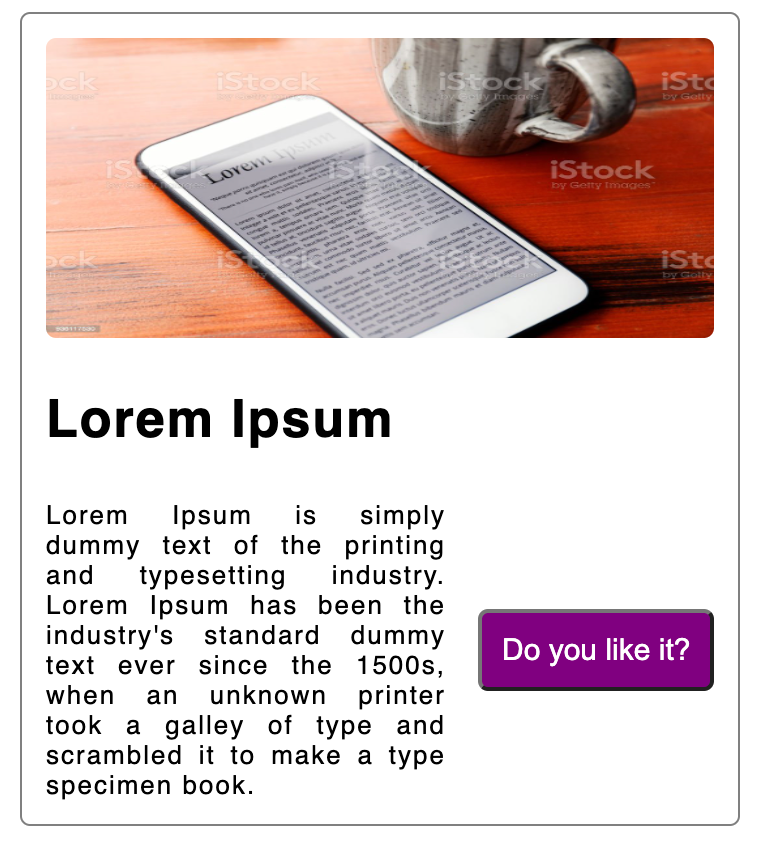
Now, if we see the card content “Lorem Ipsum” description and the “Do you like it?” button is in the horizontal direction (x-axis).

Now, let’s try to fit in this content display using the container queries.

If the size of the screen is less than 850px, this is the orientation of the card style.

Supposedly, if we have multiple HMTL elements on our page, we can still focus on a particular part of the page, and change the orientation based on the card container. That is the best part of the container queries. We are not bothered about the entire page.
That is also true, on a generic HTML page, every part is not essential that needs to be managed instead we can focus on the specific part of the page.
I hope, now it makes sense, how you can leverage the container queries and use them.
Note: The use-case of the container queries can be used for any positioning of the elements.
Fallback of the container queries.
If the browsers don’t yet support container queries, grid and flex can be used to create a similar effect for the card component used on this page. The following example uses a grid-template-columns declaration to create a two-column layout for the card component.
Finally, attaching the link to play around with it.
https://codesandbox.io/s/sweet-fog-vojyrn
I hope, you have enjoyed reading the article.
Follow me for a relevant article that might help in your web development journey.